Project 2
Types of Data
Ordinal Data
Ordinal data is a categorical data type which can be ordered in a specific fashion, or there is some scale that provides ordering. An example for this would be data from a questionaire which asks you to rate something on a scale, such as happiness or satisfaction.
If a restaurant asked you to rate your satisfaction with your meal on a scale from 1 to 5, this would be ordinal data.
To build a model of this data, an ordinal regression could be used. We do need to select some features, which might be anything from length of time spent, amount spent, and specific dishes ordered.
The target would then be the rating they provide.
Continuous Data
Continuous data is a quantitative data type that exists on a continuum. It has infinite possible values within a given range (the range could also be infinite). A common example would be temperature.
An example model could have temperature as a feature and attempts to predict some target. For instance, if we wanted to predict how long a fire would burn for based on its starting temperature, we would have temperature as a feature (continuous data) and burn time (continuous data) as a target.
Nominal Data
Nominal data would represent qualitative data which cannot be ordered. Examples of such data would be country, gender, or color.
Beta Distribution Graphs
1000 random numbers between 0 and 1.
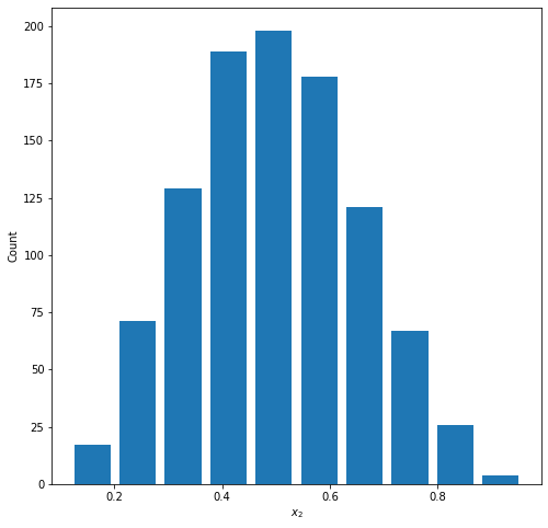
Graph 1: Normal
Parameters: a=5.0, b=5.0
Mean = 0.497
Median = 0.491
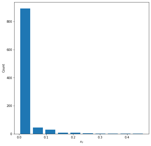
Graph 2: Right Skewed
Parameters: a=0.1, b=5.0
Mean = 0.0176
Median = 0.000120
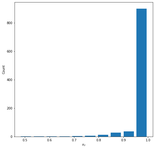
Graph 3: Left Skewed
Parameters: a=5.0, b=0.1
Mean = 0.981
Median = 0.9999
Gapminder Data
Life Expectancies
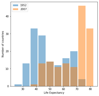
Graph 1: Life Expectancies in 1952 & 2007
Graph 2: Life Expectancies in 1952 & 2007 with Logarithmic Transformation
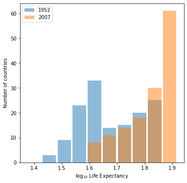
Which is better?
Graph 1 is better. Life expectancy is not a number that’s very interpretable with a logarithmic transformation. The buckets are much more interpretable in the untransformed graph, and the data is reasonably spread out across the buckets to give us a good visual comparison.
Populations
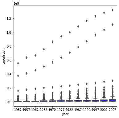
Graph 1: Population for all Countries by Year
Graph 2: Population for all Countries by Year with Logarithmic Transformation
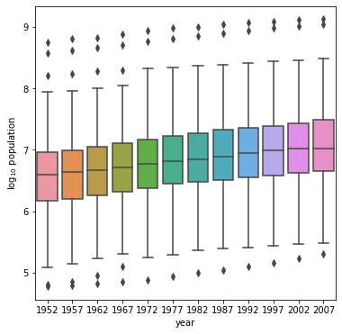
Which is better?
Graph 2 is better. Population numbers appear much clearer once a logarithmic transformation is applied. This transformation helps normalize the dataset, as population is a highly skewed variable in this dataset. The result is clear - the boxplots are actually visible and look great in the second graph, but are squashed flat in Graph 1.